2014 has been a year of changes in the web design industry so far. The web design companies and businesses that are looking to design or redesign their business website have came across many of these changes. We being a leading web design company based in Cochin have noticed those changing trends in the webdesign concepts. We have discussed earlier about this in another blog post and now let us have some other view of the changing web design constraints of 2014.
Flat design flourish
Flat web design is modest design on steroids. If you consider this as just another cult, then you are mistaken. Being flat is all about making the web design simple, neat and yet modern and these are the same demands of most of the clients. People love scrolling down, mainly in today’s digital devices from which they access your website and that makes sense of having a flat web design. Flat design makes less confusion more white space and a much better user experience.
Responsive web design
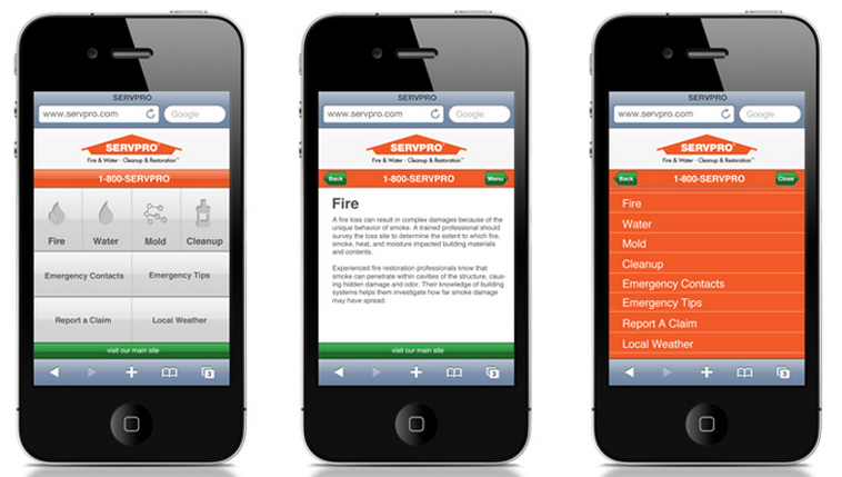
Responsive web design will be a must standard for websites in future, why future? It is one now itself. Every business needs it and they will ask for it. As we have seen earlier smart phones and tablets leads the list of website traffic and even smaller business owners will be demanding the responsive designs.
Quality images making web pages attractive
Having better quality images have always been designers choice for a long time. In 2014 this has became the choice of site owners also, since pricing for these images are affordable and high quality images are available everywhere. This indeed is going to make web pages having high quality images that bring creativity and uniqueness to web design.
Typography of web pages
We have earlier discussed in this blog about the introduction of artistic fonts to web designs, but its more than that. 2014 has witnessed typography and font usage rising to a main stream factor of attractive web designs. Mobile apps have exposed our eyes to all types of typography and that contributed a lot. The business owners also will get bored of seeing same good old Times New Roman and will be happy to afford some payment for a better font.
Having videos in web design
Vine has helped in re introduction of videos into website designs with minimum buffering and easy loading. We have seen short videos going viral in social Medias and this indeed makes a point. If you can create a 30 second clip that conveys the exact message, adding that video to the business web site design will be a smart idea.
Content rules at the end of the day
Content has been one of the oldest trends of web design industry and no one call it a trend anymore. The recent attitude of those content centric businesses, especially news websites has greatly influenced by content. We have seen news websites like New York Times choosing a website design which strips away all of those elements that takes the spotlight away from content and highlighting the content more than before.

These tips are really great. People will learn a lot about wed design constraints and all they want to know from this article. This will surely give them the keys to making a better design for their new website.
This blog is indeed a nice and informative blog. Thank you for sharing this blog.